CLIENT WORK
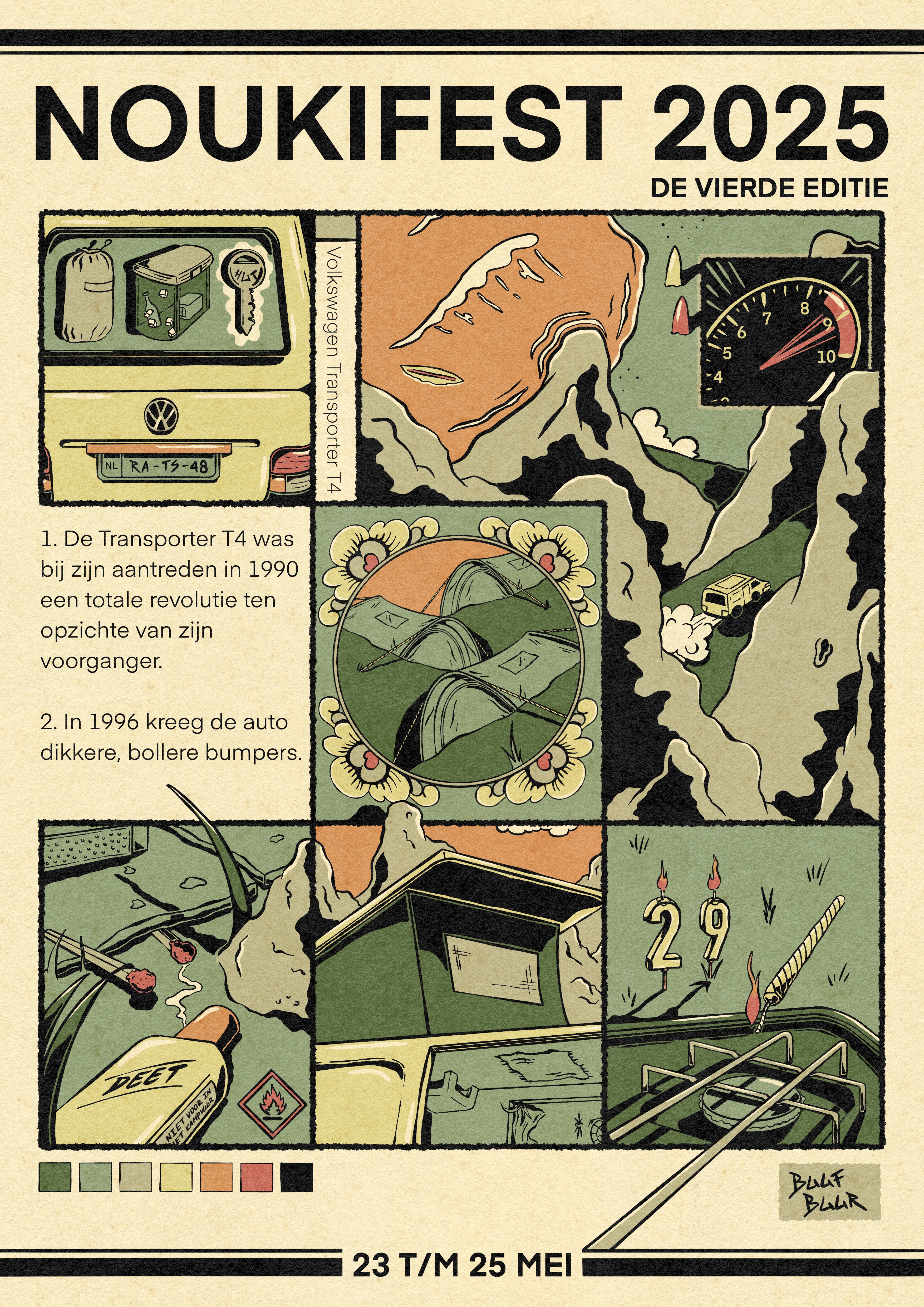
NOUKIFEST POSTER {2025}
This is the third poster I designed and illustrated for a camping weekend party.
For this poster design I was inspired by the clients Volkswagen Transporter T4 van.


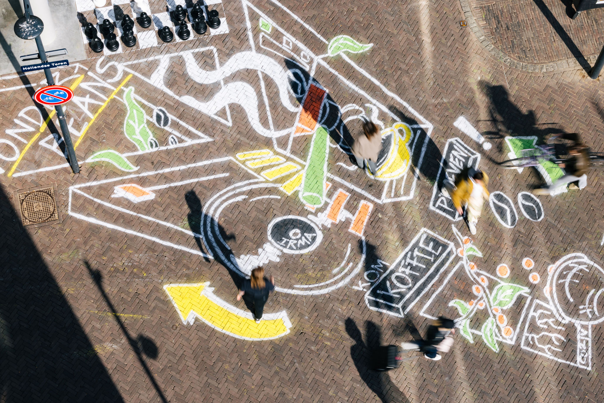
WONDER BEANS CHALK SIDEWALK {2025}
On the 11th of April there was a celebration event for the new partnership between Wonder Beans and TivoliVredenburg.
Wonder Beans is an organization that provides greed-free and sustainable coffee and tea; offering coffee farmers a fair price and reducing CO2 emissions by planting CO2-“guzzling” coffee farms.

For this event I was asked to create a chalk illustration to attract the attention of passersby, of course in theme of the occasion. Customers and passersby were able to enjoy this tasty coffee for free.
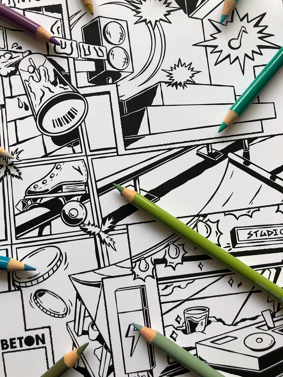
KLEUR BUITEN DE LIJNTJES {2024}
Every once in a while a second hand market, the Betonnerie, takes place in Utrecht at Beton-T.
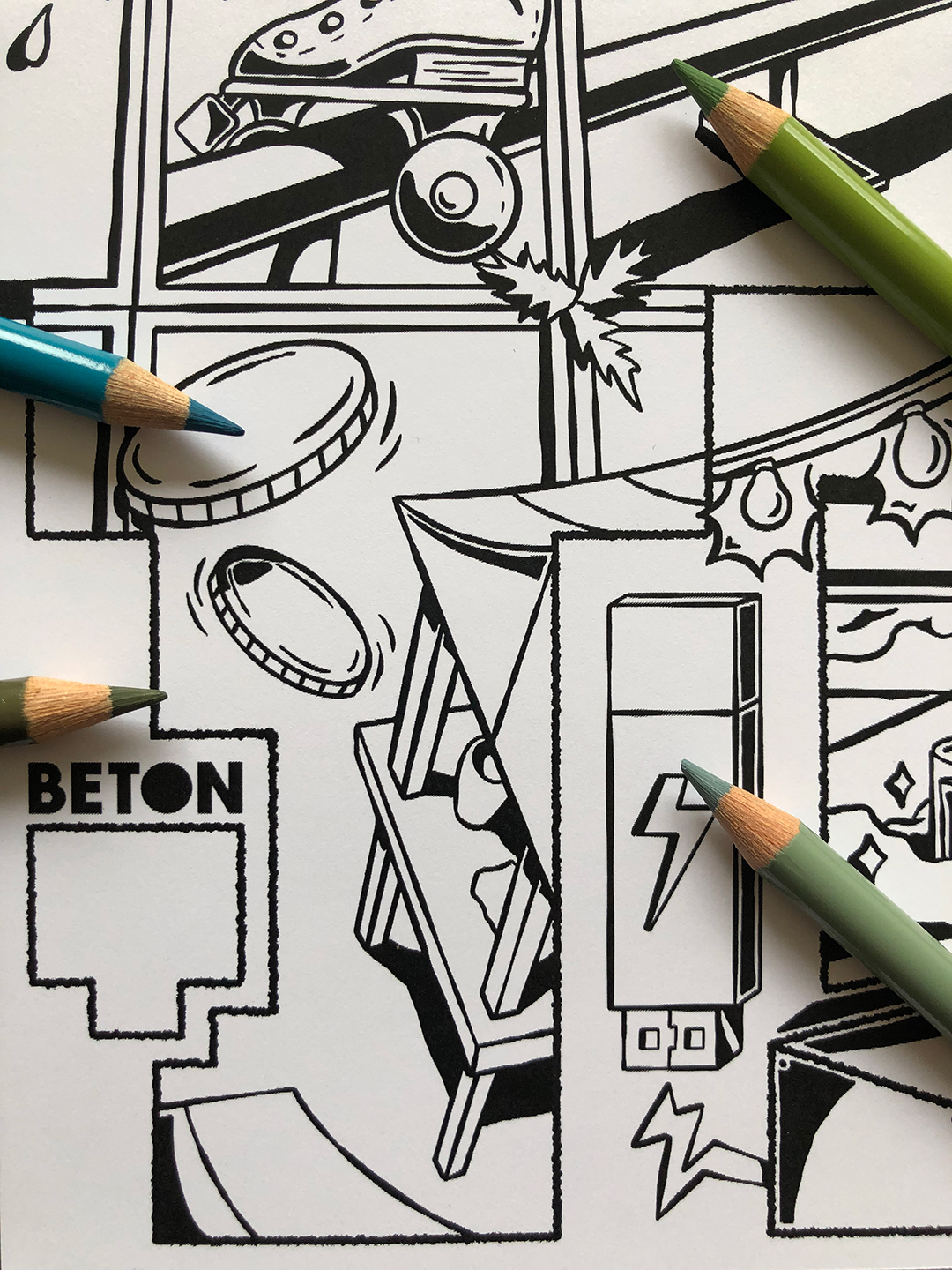
For the October edition I was asked to make a colouring page, combining all the various types of events that take place at the venue location.
From spray painting at the “hall of fame”, to concerts, to skateboarding, to dancing lessons, to Studio-T sessions and of course the Betonnerie itself.




KALF BIER NEDERLANDS FILM FESTIVAL {2024}
I created the “KALF” beer label design for the Dutch Film Festival brewed by Vandestreek brewery.
The theme of the illustration is “the filmmaker” in which the illustration features a “standard” filmcrew in a storyboard.
See: director, camera crew, sound crew, lighting crew, set, script writers, actors and actresses, etc.
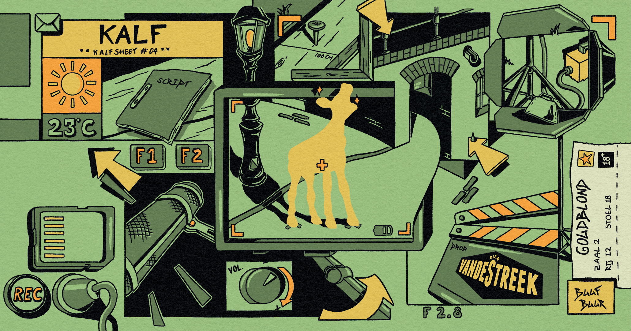

Green label: Golden blonde 6%
Blue label: Non alcoholic blonde <0,5%

VAN KASTJE NAAR CANVASJE {2024}
I painted this electricity box in the Moreelsepark in Utrecht. Provided by the initiative Thirty030.

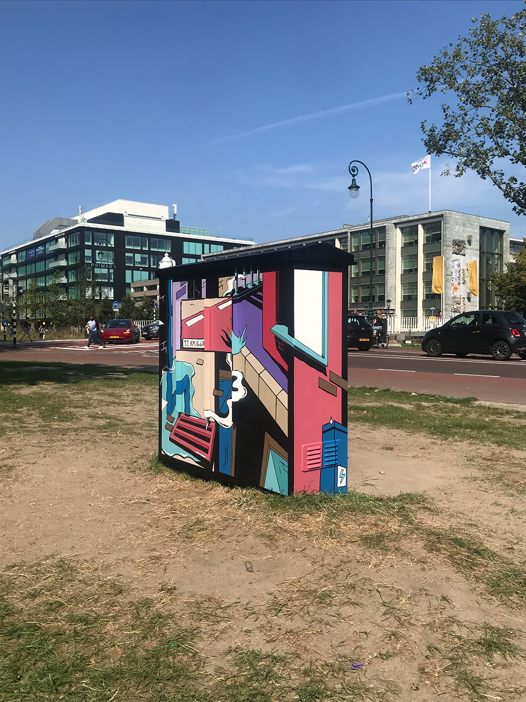


A local resident was asked to think of a theme for the painting, in which he/she said: “een ode aan ons mooie stadsie”.
So I came up with the theme “the alleys of Utrecht”. Since Utrecht has about 300+ beautiful alleys and to me they are the beauty of our city.
Since the location is near the trainstation and a busy crossroad, I combined these elements into the painting as well.
McDONALD’S ESCAPE ROOM {2024}
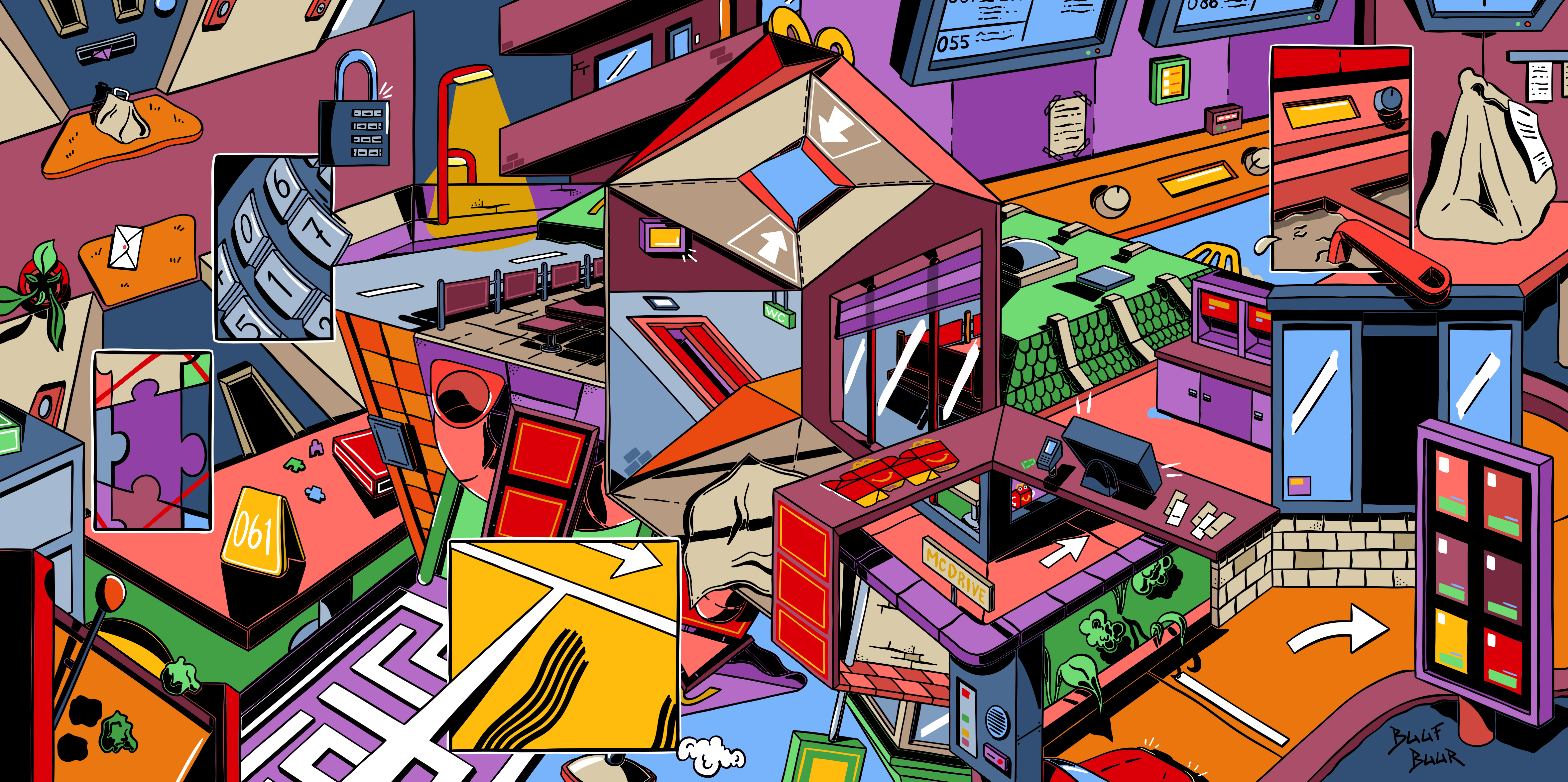
I was asked to make a “Where Is Wally?” style illustration for a McDonald’s Escape Room.
In which you need to find the “Happy” figure. It is the first of three games you need to finish of this Family Events social media campaign.


For this illustration I used architectural elements of McDonald’s as well as a few games which are incorporated in the Escape Room.
The illustration got printed on a 100 cm x 200 cm board and got placed inside the giant wooden Happy Meal.

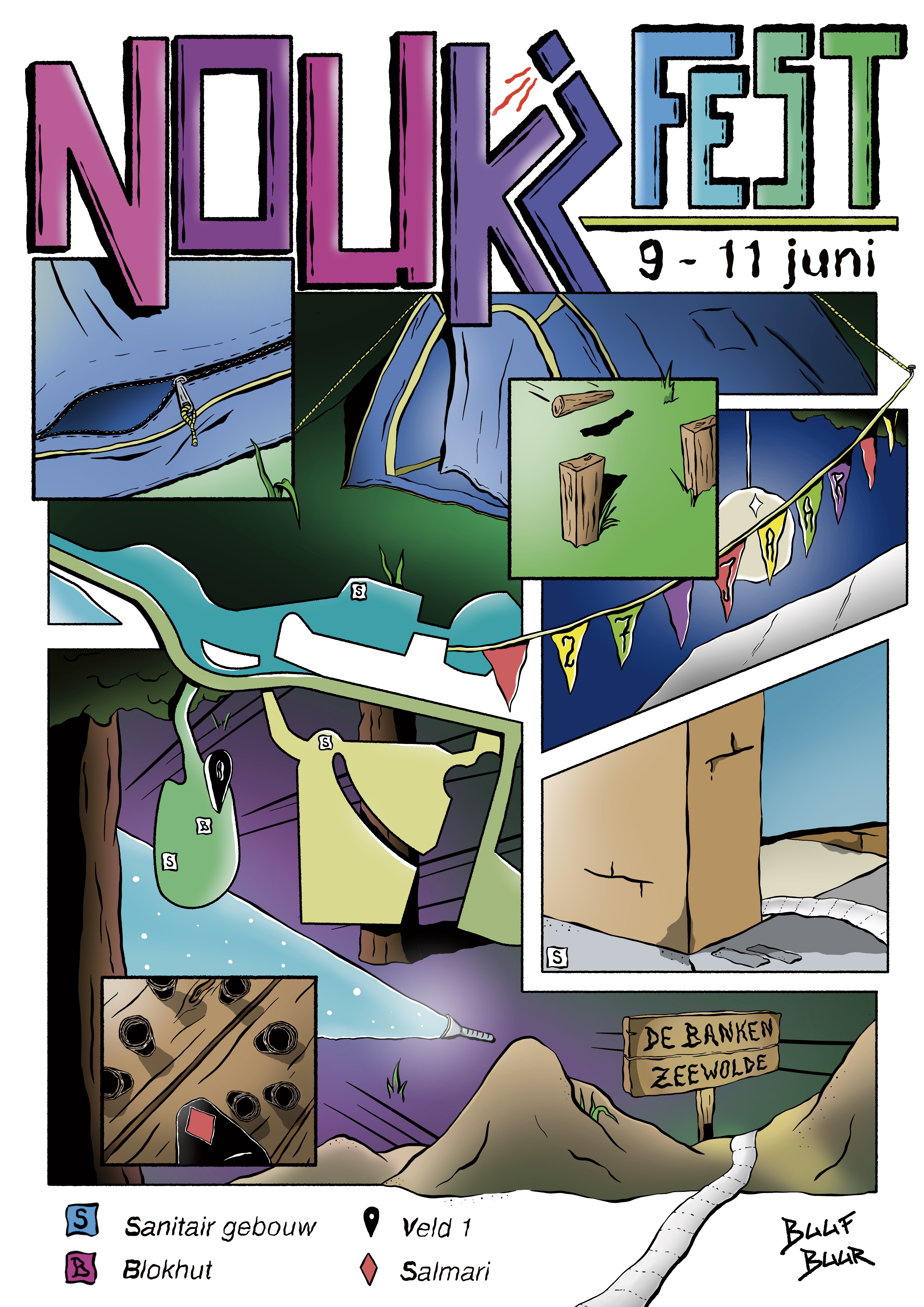
NOUKIFEST POSTER {2024}
This is the second poster I designed and illustrated for a camping weekend party.
For this poster design I was inspired by the style of “the standard” travel agency website, but combined with a Buuf Buur twist.


Here’s a collaboration piece by Luus Damen and I. We were asked to create a personalized present which could be used as a “storage tube”. The artwork is painted with acrylics and markers. The theme of the painting is a “pensioners paradise”.
NOUKIFEST POSTER {2023}
A poster designed and illustrated for a camping weekend party. Humor was an important part for the style of this illustration. Hence the toilet roll and the “i” in the title of the poster.

CABINET OF CURIOSITIES {2023}
This black and white illustration was part of a colouring book provided by Blackbear Ink Tattoo Studio in Utrecht. For which I made my own version of a cabinet of curiosities. All profits went to the organization “Bears in Mind”.


SWAAK 130 YEARS {2022}
This is the screenprint illustration I made for Swaak’s 130 year anniversary. Swaak is an art supply store in Utrecht. I combined some architectural elements of the store with some of the materials and supplies they sell.

BIRDCAGE PARADISE POSTER {2022}
Birdcage is a DJ collective from Utrecht. They asked me to make the poster for one of their dancing events in club EKKO. For this poster I combined a dance floor and a desert type bird sanctuary.
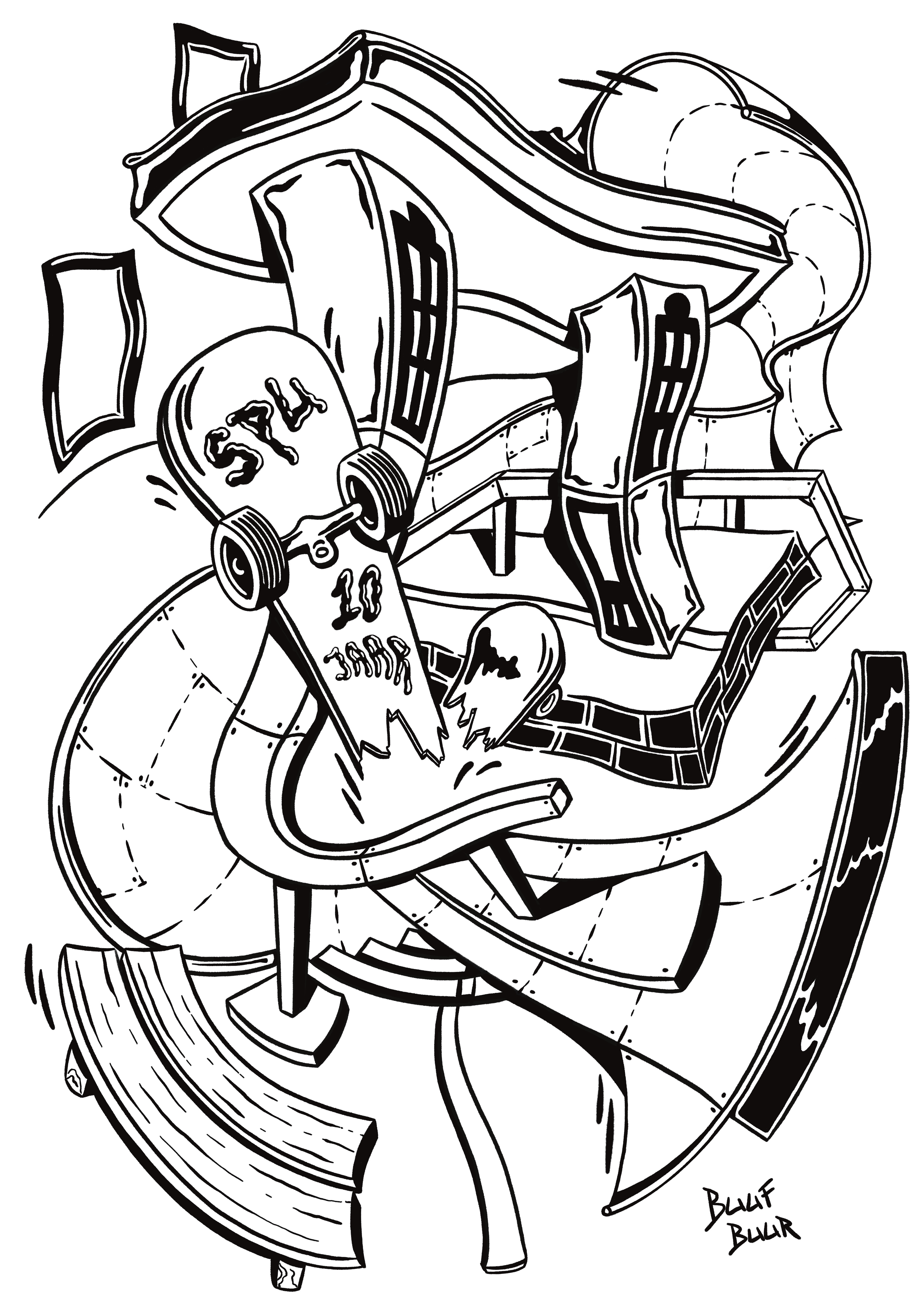
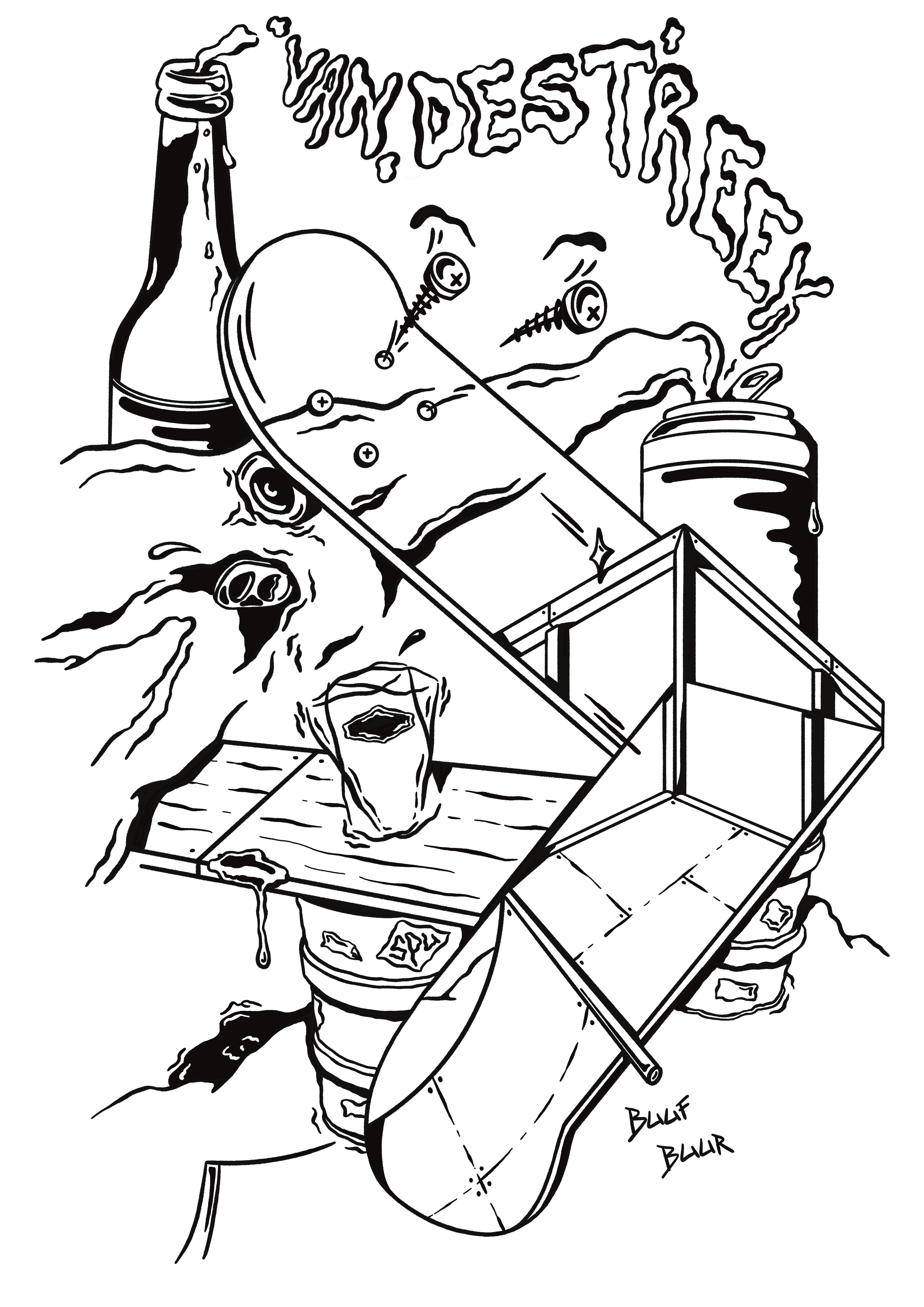
For the ten year anniversary of Skatepark Utrecht I was asked to make two screenprint illustrations for T-shirts. The first screenprint was inspired by the venue of SPU. The second screenprint was inspired by the beer sponsor of the event: Van De Streek.
SPRINGPLANK KUNSTROUTE {2022}
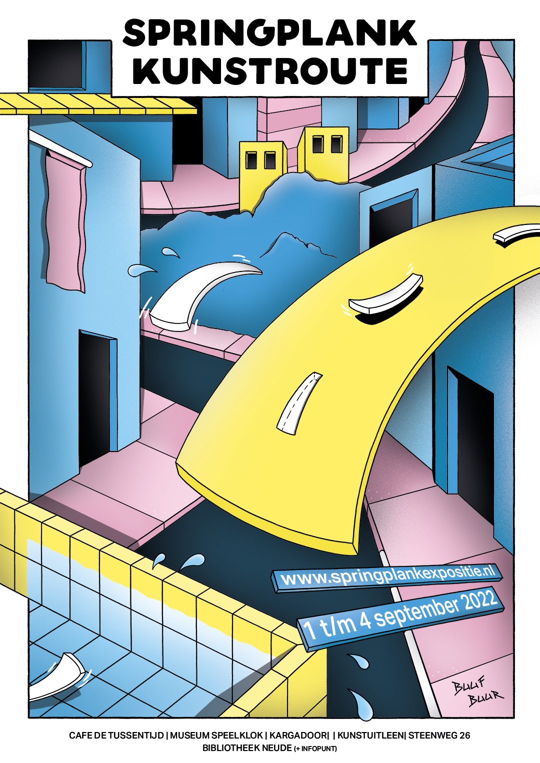
Here is the poster for the Springplank Kunstroute of 2022. Springplank is Dutch for diving board. Which became the lead inspiration of this illustration. I had to use the main colors of the organisation Springplank. Which were as you can see: blue, pink and yellow.


THE CREATIVE PLAYGROUND CONTAINER {2022}
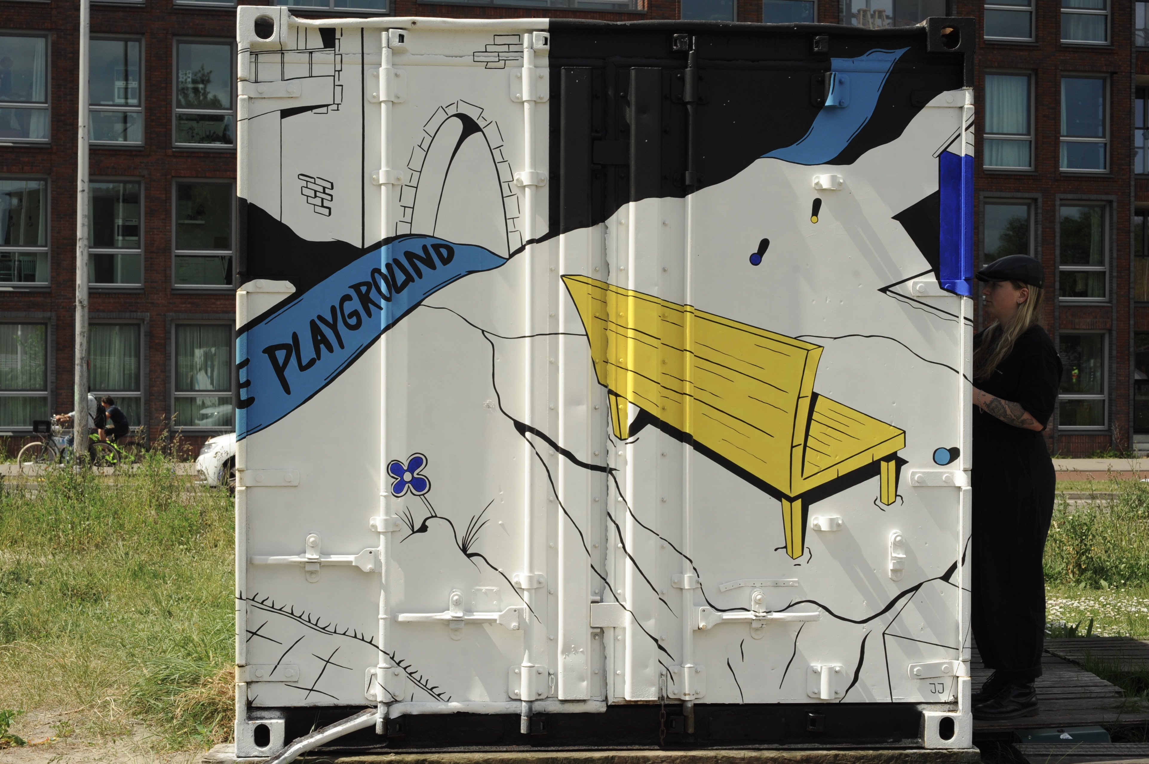
I was asked by the team of The Creative Playground to paint their container on Perron West in Utrecht. Three sides of the container consist of one big illustration done with acrylic paint. Taking inspiration from their name “the creative playground”.
The last part of the container is spraypainted as an individual artwork. For which I got inspiration from the busy traffic lights near the container.
THE PATH OF LIGHT ALBUM COVER {2022}
This is my first album cover illustration. The cover was created for a music organisation called Minokawa Records. The theme of the album was based on the mythology of the Minokawa bird who after swallowing the moon and spitting it out, destructed a village.


DISCO DOOR {2021}
I was asked by a client to create a disco themed door for his house. For this he asked for elements such as: the flamingo, the discobal, the rum bottle and the mini pool.


INDO FOODHOUSE TOILET DOORS {2021}
These toilet doors were specially painted for the indonesian restaurant Indo Foodhouse in Utrecht. I combined the overall artwork of the men’s and the women’s toilet doors. Done with acrylic paint.